






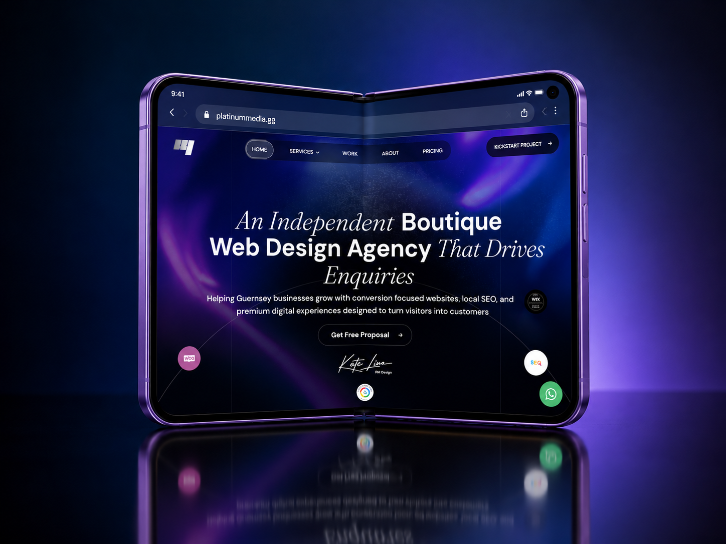
A website can look exceptional on a desktop and still fail to deliver a good experience on a mobile device.
For many potential customers, their first interaction with a business happens through a smartphone. Whether they are searching for a service, comparing companies or making an enquiry, they expect the experience to be simple and intuitive.
Yet mobile design is often treated as a smaller version of the desktop website, rather than an experience that deserves its own consideration.
Mobile Design Is More Than Responsiveness
A responsive website adjusts to different screen sizes, but that alone does not guarantee good usability.
Navigation, content hierarchy, button placement and spacing all need to work naturally on smaller screens.
Effective mobile design considers how people actually interact with their devices, rather than simply rearranging desktop elements.
First Impressions Happen on Small Screens
A difficult mobile experience can quickly influence how visitors perceive a business.
Overlapping content, unreadable text and awkward navigation can make even a professional company appear less credible.
A carefully designed mobile website communicates the same attention to detail and quality as its desktop counterpart.
Making Every Interaction Easier
Mobile visitors often want information quickly.
Clear navigation, readable content and accessible calls to action help people find what they need without unnecessary effort.
Simple interactions, appropriately sized buttons and straightforward enquiry forms can make a significant difference to the overall experience.
Performance Matters on Mobile
Large images, excessive animations and unnecessary scripts can affect loading times, particularly on mobile connections.
Optimising images, reducing unnecessary elements and considering how content loads helps create a faster, more comfortable browsing experience.
A visually impressive website should never come at the expense of usability.
Mobile Experience and SEO
Mobile usability also plays an important role in search visibility.
Google primarily uses the mobile version of a website's content for indexing, making it essential that important information remains accessible across devices.
A clear structure, consistent content and strong technical performance create a better foundation for both users and search engines.
Designing for Different Experiences
Desktop and mobile visitors may interact with the same website in different ways.
A complex navigation system or elaborate animation might work beautifully on a large screen but feel unnecessary or distracting on a phone.
Thoughtful design adapts these elements to suit the device while maintaining a consistent brand experience.
A Better Experience Across Every Device
Mobile design should be considered from the beginning of a website project, not addressed only before launch.
At Platinum Media, we create bespoke websites with attention to usability, performance and visual consistency across different screen sizes.
For businesses in Guernsey, the Channel Islands and beyond, a considered mobile experience helps ensure potential customers can explore services, understand the business and make enquiries wherever they are.
A well designed website should feel just as considered in the palm of your hand as it does on a desktop screen.
Is Your Website Delivering the Right Mobile Experience?
Get in touch with Platinum Media to discuss a website designed to perform across every device.